
Article: Using Colour Theory to Elevate Your Home Interior Colours
Using Colour Theory to Elevate Your Home Interior Colours
After long days and busy weeks, we all turn to our homes for comfort.
Some days, it feels - Perfect. Calm & Comforting. Like a warm hug waiting for you at the door.
And then there are days when nothing looks wrong, but something feels off.
The bed is made. The cushions are in place. The lights are exactly how you want them to be.
Yet…. the space doesn’t feel as soothing as it should, sometimes even a little draining.
It’s that quiet, unexplainable feeling most of us experience.
This shift isn't a coincidence.
It’s colour.

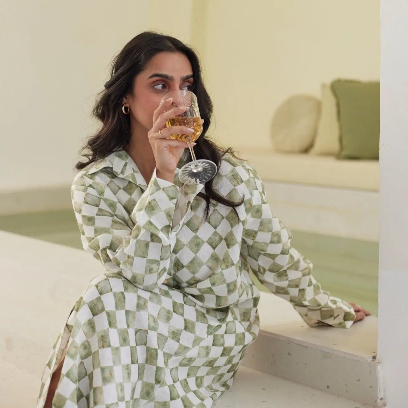
Perhaps a vibrant yellow kitchen sparked joy, or a serene blue bedroom brought a wave of calm. It's the profound, often subconscious, power of home interior colours at play.
Colours aren’t just aesthetics. They are associated with our emotions, atmosphere, and memory. It’s one of the most powerful tools we have to shape how a space feels, and how we feel within it.
We like to think of colour as quiet energy. Every shade carries its own mood. When chosen thoughtfully, it can turn your house into a sanctuary.
Decoding Colour theory and how it impacts your room interior design
Like us humans, colours also don’t exist in isolation. They talk to each other.
Stronger, deeper tones tend to energise a space whereas softer, pastel shades bring calm. But how you experience colour is deeply personal.
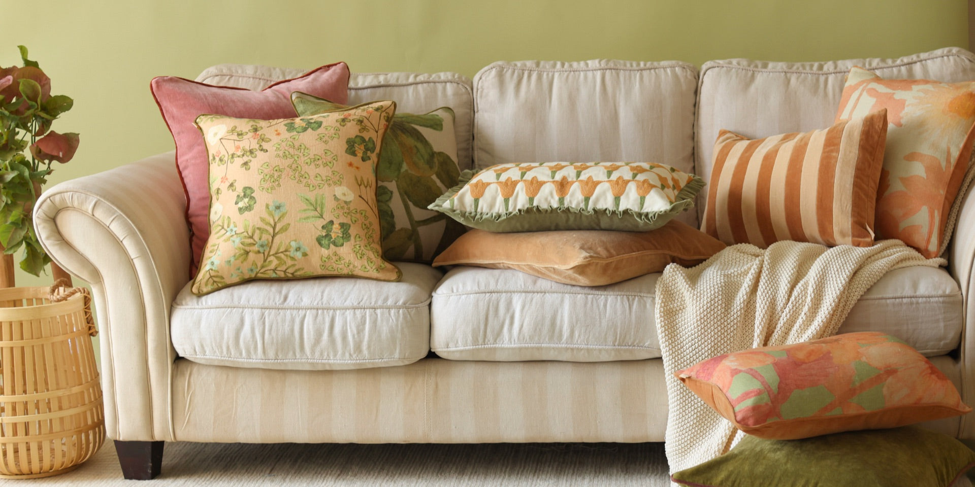
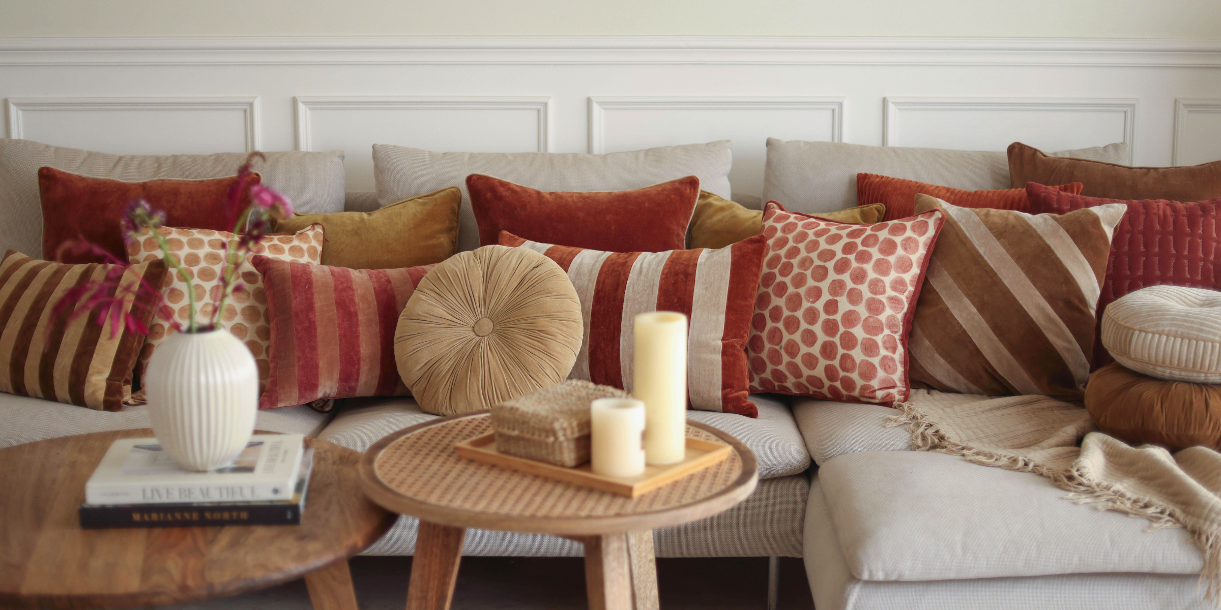
Warm hues like terracotta, rust and mustard spark joy whereas red and orange spark creativity. Cool shades like blue, green and soft pink invite rest and reflection. Neutrals ground everything, giving the eye space to breathe.
This is where planning comes to picture and styling becomes intuitive.

Understanding the colour harmony
Consider the colour wheel a styling guide. Once you know how shades interact with each other, creating a balanced home palette feels more fun.When combining colors for your space, there are a few simple approaches you can use -
Monochromatic
This approach uses a single colour, simply moving through its lighter and deeper versions. Think soft beige layered with sand and caramel tones. The result feels calming and beautifully understated.
Analogous
These colours sit right next to each other on the wheel, which is why they flow so naturally together. Sage paired with sky blue creates a gentle harmony that feels comforting and easy on the eyes.
Complementary
Here’s where the contrast comes alive. These shades sit directly opposite each other, bringing energy into a room. Teal paired with warm coral or navy paired against soft mustard adds vibrancy while still feeling intentional.
Split-Complementary
It’s a softer take on bold contrast. Begin with one colour, then introduce the two shades sitting beside its opposite. Dusty blue layered with hints of terracotta and blush feels balanced, thoughtful, and dynamic.
Triadic
This scheme focuses on three colours that are evenly spaced around the colour wheel, forming a triangle. It’s playful yet composed, giving you room to experiment while keeping things visually grounded. Muted blue, soft yellow, and gentle coral together create a playful yet composed palette, offering variety while maintaining visual balance.
Tetradic
This approach brings together four colours arranged into two complementary pairs. Rich and expressive, this scheme works best when one shade leads and the others support. Teal and rust balanced with blush and sage bring depth while keeping the space grounded.
Use these approaches as inspiration. Play with tones, notice what feels good to you, and allow your spaces to unfold naturally.
Tailoring Your Palette According to the Purpose - Our Guide to Effortless Combinations
Every room has its own purpose, and your colour choices should reflect that. Not every corner in your home wants the same kind of energy. Before choosing colours, ask yourself one simple question “How do I want to feel in this space?” Once you have that answer, the palette almost chooses itself.
And if you need a little inspiration along the way, here are a few thoughtfully curated references to help guide you better :

Bedroom -
We all can agree that we want our bedrooms to be as comfortable and snug as possible. Consider analogous shades such as pale peach, dusty pink or sage green. These colours sit close to each other on the colour wheel and hence are believed to create a cocooning effect, helping the body slow down and rest better. If you like contrasts, prefer quiet combinations such as pink and green or red or green. These colours keep the space interesting while preserving the calm. Pair them with a breathable cotton duvet cover, a softly layered quilt, and a few cotton throw pillows, and suddenly your room feels like an exhale.

Living room - This room is no less than a social hub and benefits from colours that keep the conversations alive and going. Here, you can experiment with complimentary and split complimentary colours like a combination ochre and ruhbarb or peach and blue. Since they are placed on opposite sides of the colour wheel, they create a contrast which allows zeal and movement into a space, perfect for rooms that are meant to feel lively and welcoming. Layer velvet sofa pillow covers to add depth or handmade crochet cushion cover for introducing texture, softness depending on the season.

Kitchen / Dining Area - These areas are the heart of the home and usually thrive on colours that stimulate appetite and conversation. Opt for warm tones such as terracottas and oranges that can be invigorating. Crisp whites make your space look bigger whereas subtle greens can create a clean, fresh feel.
Art of Easy Mood Shifts
Painted your walls recently? You don’t have to worry about getting them repainted to change the mood of your home.
Sometimes it’s as simple as swapping pillows, curtains, lighting introducing plants or accessories. Small shifts can also create a big emotional impact.
Colours work best when they are layered, lived-in and natural. Mix textures. Play with tones. Let your home evolve with your moods and seasons.
Because at the end of the day, colour isn’t something about trends.
It’s about creating spaces that support how you live, rest, gather and dream and make everything enjoyable.
Your home already has a story. Colour just helps it speak.
Consider this as your sign to add colours to your life..
Need a little guidance? Get in touch, our designers are ready to help you along.
At Sanctuary Living, creating emotionally nourishing spaces isn’t just what we do, it’s why we exist.
If you’d like a deeper and more thoughtful guidance for your space, get in touch with our designers below who would love to help you a shape that feels both intentional and beautifully yours.
Written by Ramita Ahlawat
Leave a comment
This site is protected by hCaptcha and the hCaptcha Privacy Policy and Terms of Service apply.